
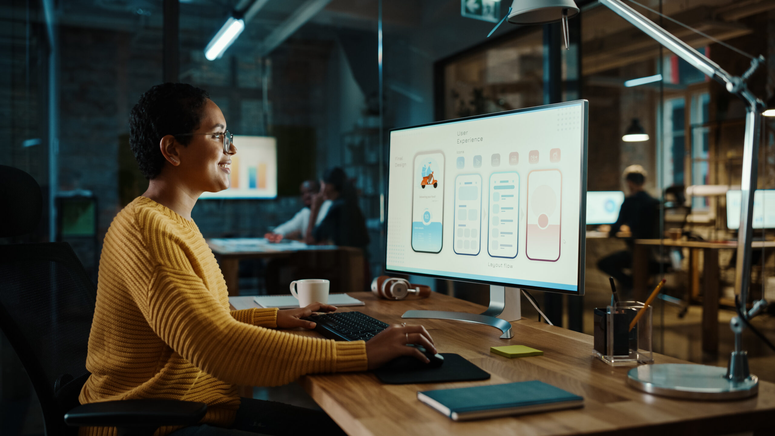
Mali Holmes is a UX (user experience) designer and accessibility pro who’s been working with leading companies like CVS to make online experiences more user-friendly. Holmes specializes in identifying flaws that create barriers for people with certain disabilities from accessing online content. Oftentimes, breaking down those barriers makes content better for all users, not just those with disabilities. Whether you’re a seasoned business leader or an aspiring entrepreneur, these seven tips that Holmes shared with Verbit can help improve your website’s accessibility and user experience.
1) Begin with quick website fixes for accessibility
When reviewing a website or content online, Holmes looks first for a few common accessibility issues that are simple to correct.
“To start out, I always want to look at the really easy things to catch,” she said. “Something like that would be color contrast. I will always immediately scan a design for color contrast.”
Low contrast between text and the background can make it difficult to read content on a page. For example, light yellow text on a white background can be challenging for anyone visiting a site. There are many color combinations that can make reading more difficult, especially for people with color blindness. It’s important to measure the actual contrast. The Web Content Accessibility Guidelines (WCAG) has guidelines for contrast and there are tools you can use to check as well.
Next, Holmes looks at the headings on each page of the site and determines their compatibility with screen readers. This check helps to support people who are blind and are likely using screen readers to navigate your website.
“I make sure that the information hierarchy matches the visual hierarchy and that way when a screen reader user goes through it, it’s a lot easier to navigate because they can skip from header to header to find information they’re looking for.”
Using headers in content instead of just making bold font headings allows users to jump through the way readers scan through a page to find what they’re looking for. Fortunately, designating H2s and H3s is fairly straightforward, although it’s also easy to overlook. Marketing teams or whoever handles the site’s online content can check to ensure they’re using headers in WordPress or whatever platform your business uses.
2) Try to make your page layouts simple
“Tables can get really complicated for screen reader users or users with cognitive disabilities,” said Holmes.
Cognitive disabilities include autism spectrum disorder, brain injuries, strokes and other conditions that can impact memory, learning, concentration and more. While some tables can be useful and easy to follow, it’s important to evaluate them to ensure they’re as straightforward as possible.
“Simple tables don’t often present a cognitive load issue,” she explained. “But, if you’re starting to present really complex information within a table, that can be a huge cognitive load for people, and so my main mission is to simplify the information and get down to the essence of what that table is trying to communicate. I can cut down on the frills so that it’s easy to comprehend.”
Holmes provided an example of a chart that compares different models of iPhones.
If a table simply compares whether different phones have a feature or not, using check marks to indicate yes or no, it might be easy enough for people to follow. However, if the chart compares dozens of technical features and specs, it might only make sense to people who are highly knowledgeable about the topic.
Holmes suggests finding simpler ways like bullets instead of tables to present the information. Rather than placing lots of information within tables, consider linking to other pages that go more in-depth.
3) Giving users agency improves multimedia accessibility
Your website likely contains more than just text and images. For instance, it may have video and audio content, too. There are specific things to check for when using these types of media.
“For any type of animation [such as GIFs], you want to make sure that it can be paused for the user, or the user can have computer settings that will turn off animation,” said Holmes. “For people with seizure disorders, the wrong GIF can trigger a seizure.”
The ability to pause or turn off animations is also about “giving the user agency.” While a GIF might not have drastic consequences like a seizure for everyone, other users may find it distracting or otherwise bothersome. Even in those scenarios where the stakes are lower, the user’s ability to control what they’re seeing should be a priority.
4) Helpful tools for enhancing accessibility
Holmes expressed the importance of some common accessibility solutions that support individuals who are Deaf or blind.
“I really want to make sure that there’s some sort of closed captioning. Audio description is a great addition. A lot of different companies have different budgets and that’s understandable. So, auto-captions are better than nothing, but having accurate captions and audio descriptions is always important.”
Holmes’ time at CVS highlighted some reasons why accuracy is so critical.
“Working in healthcare, if you’re giving an informational interview or an informational video about some sort of health plan or medications or health instructions, those things really need to be communicated accurately,” she said. “There, there can be a huge human impact when you’re working in that type of field. It could even be a liability.”

5) Design for a less tech-savvy audience
Some accessibility considerations have to do with the complexity of the writing and the layout of the page. Is the writing clear? Is it easy to find important links or information?
When Holmes looks through pages for some of these potential issues, she says she thinks about her grandmother.
“When I look for the more complicated things, honestly, I think about how my grandma would go through the website,” she said. “My grandma is pretty good at technology, but she constantly calls me asking me to walk her through different website flows. I think to myself, if my grandma saw this, is this something that she would be able to figure out without me? If it’s not, how can I make it easier for her to understand?
When it comes to what Holmes might change because of this approach, there are a few things she considers.
“I’ll look at the language,” she said. “I will look at the proximity between different patterns. I want to make sure that a button or a link is very close, nearby to the thing that it might be related to. I’ll look for consistency across the website.”
Making content as simple and easy to use as possible often improves the experience for all users, not just those who require accommodations.
6) Aesthetics and accessibility can go hand-in-hand
Even as companies become more conscious of accessibility concerns, their web designers and marketers want their content to remain aesthetically pleasing. At times, these two objectives conflict.
“I try to let my designers know the human impact of patterns,” she explained. “Understanding how people interact with the pattern makes it a lot easier to solve problems. What I have learned is that a lot of times accessible design is good design for everybody and so there are occasions when it’s not the most aesthetically pleasing. But when you do prioritize accessibility, it tends to make the experience easier for everybody.”
Sometimes, Holmes finds unintended benefits of pushing for accessible designs.
“A lot of times, this pushes designers to go outside of their comfort zone and find a pattern that ends up looking better than before,” she said. “For example, one of my designers wanted to use a text in front of a gradient, which looks nice, but can cause readability issues,” said Holmes. “We asked, ‘is there another place this gradient can go that can still add that fun pop of color without compromising the readability?’” she said. “We were able to work that gradient into decorative patterns across the page instead of just a background behind the text. It ended up looking a lot cleaner in the final iteration than it did in the less accessible one.”

7) Taking steps upfront is always better
Failing to make applications, websites and platforms accessible from the start leads to higher costs and more work further down the road, Holmes said. This concept is sometimes called “accessibility debt,”.
“I really want to make sure that accessibility is baked in,” she said. “It prevents so many defects and so much rework and just really saves everybody so much time and money. Every defect that I worked on at CVS took roughly two to three hours. I’m in meetings with probably four to five people, so that is a huge amount of time.”
Holmes explained that even simple issues become challenging to remedy when teams catch them too late.
“A defect for color contrast is such an easy fix,” she said. “A designer can just go into a file and fix the color contrast. But if a design makes it into testing, which is the phase right before launch, with the color contrast error instead of just going in and fixing it with the designer, the engineers have to log it as a defect.”
According to Holmes, once it becomes this type of issue, it has to go through multiple departments and becomes a “complicated process for something that could be easily fixed in one minute.”
Holmes points out that neglecting accessibility in the design phase is “a huge waste of money.”
Enhance your accessibility with support from expert partners
Business leaders looking to enhance customer experiences and steer clear of accessibility pitfalls, should look to the growing accessibility community for guidance. Experts like Holmes are often happy to help and can spot issues before they become costly challenges.
“The community of accessibility professionals are literally the best people in the whole wide world,” she said.
Verbit’s team is also trained in providing accessibility guidance, as well as solutions to assist companies on their journeys. Whether it’s improving the user experience of your website with more ways to engage with your content or supporting individuals with disabilities, our tools like captioning and audio description are trusted by businesses worldwide. Reach out to us today and discover how our team can champion your accessibility initiatives.