Chances are, you’re using Word or Google Docs at work every day. In many cases, you’re likely working collaboratively with others on those documents. However, could your word processing practices be making your documents inaccessible?
While making more inclusive documents is simple, it’s also easy to overlook potential accessibility pitfalls. Here are five tips that will help you produce better, more accessible documents.
1
Use built-in headings like H2 and H3
If a person uses a screen reader, which is a tool that reads content on a page to provide access for people who are blind or have low vision, the heading designations are required for navigation. Much like a person who is reading a document may scan through the headings to find relevant information, a screen reader can jump to headings to offer its user the same ability.
The headings also allow those using keyboard navigation to jump through the document. While some people use keyboard navigation based on preference, it’s also a tool that people who are blind use. Individuals with certain mobility-related disabilities and those with repetitive stress injuries may use this feature instead of a mouse as well.
How to add headers in Word and Google Docs:
Word: Highlight the heading text. Select “styles” (the icon of the capital “A” with the paintbrush) and choose H1, H2 or H3.
Google Docs: Highlight the heading text. Select the dropdown style menu, which defaults to “normal text” and select your heading.
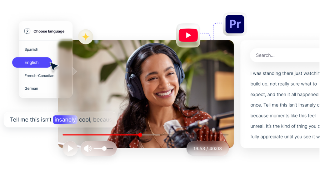
2
Add alt text for images
When someone uses a screen reader, the alt text allows them to hear a description of the images in your document. If the image has words or numbers in it, the alt text should include those. Additionally, the alt text should never start with “an image of” as the screen reader states this before providing the user the alt text.
How to add alt text to images in Word and Google Docs:
Word: Highlight or click on the image. Select “alt text” in the menu bar and add a title and detailed description in the “format picture” box that appears on the right.
Goggle Docs: On a PC, right click the image, and add select alt text. On a Mac, press ⌘ + Option + y and fill in a detailed description and title in the box that appears. Click “okay.”
3
Use descriptive text in hyperlinks
People using screen readers also sometimes scan documents for links. If you’re linking to other documents, tasks in workplace management systems like Asana or sources, make the link text as clear as possible. Imagine if the user is only hearing the links on their own. Is the text enough to let them know what they would be clicking on?
How to make hyperlinks more accessible:
Imagine you’re adding a link that connects to your company’s internal writing style guide.
In this example, users won’t know what they’re linking to:
For tips on how to write in our unique voice, click here.
Instead, make it clear in the link:
For tips on how to write in our unique voice, read our writing style guide.
4
Choose the right font
When it comes to accessibility, not all fonts are created equal. It’s best to use common fonts that are more likely to appear correctly on different devices and make it easy for screen readers to interpret. Also, avoid any font that has letters or numbers that look too similar. For instance, if the lowercase “L” and the “1” look the same, this can be confusing. Additionally, some fonts are more difficult for people with dyslexia to read.

How to choose an accessible font:
Select fonts like Times New Roman, Arial, Calibri, Tahoma, Verdana and Helvetica. These choices are common and clear.
Avoid Trojan Pro, Courier, Souvenir and Copperplate Gothic, which are some of the worst fonts for people with low vision. These are also hard for people with reading-related disabilities to focus on.
Additionally, avoid changing the color of fonts to something that has low contrast with the background colors, as this can create issues for people who are colorblind.
5
Don’t use tables or charts (unless you really have to)
Tables are charts can be a good way to display information visually, but they are difficult for people to interpret with a screen reader. Microsoft recommends avoiding them in documents, when possible, to make the content more accessible. If you need to use them, there are a few ways to make them more accessible.
How to make tables more accessible:
- Don’t make them fixed width, which causes the text to stay the same size, and prevents effective use of Magnifier, an app that supports people who have low vision
- Use headers like H2s to help people navigate the table
- Don’t nest a table within a table, split or merge cells because screen readers navigate tables by counting cells and these features make it difficult to interpret the information
- Avoid blank cells, which may indicate to a person using a screen reader that there is nothing else in the table
A note on accessible content
Making Word and Google Docs more accessible will help people collaborate more effectively. However, even if the documents are technically accessible, the content may not be. It’s wise to practice communicating ideas in ways that are simple and straightforward.
Here are a few ways to make content more accessible:
- Make sentences short
- Use simple language over complex terminology and jargon
- Aim for at most, an 8th grade reading level
- Keep paragraphs short
- Break up text with headers
- Use active voice instead of passive voice
Making Word and Google Docs more accessible doesn’t just support people with disabilities, it makes it easier for everyone to work together. Accessible content is a part of quality, effective communication.
Verbit supports businesses and other organizations with its innovative accessibility tools. Reach out to Verbit to learn more about how our captioning, transcription and audio description solutions can make your company more inclusive.