There’s no way around it – the internet is now a main source of information for most people. When it comes to government agencies, this means that people are turning to websites to navigate social security, renew drivers’ licenses, register businesses and so much more. If government websites don’t offer clear, easy-to-find information, people will face hurdles when trying to access the services they need.
User experience, or UX, is a common term in the private sector where a poorly designed website may turn away customers and cost a business revenue. However, government agencies, whether federal, state or local, all need to design quality websites as well. For government officials, prioritizing UX is the only way to better serve the public. Explore below the significance of UX in the public sphere, learn how it relates to accessibility and discover some insights on creating better experiences online.

Why Government Agencies Should Care About UX
Whether in business or government, a high-quality website helps build trust. People are skeptical of websites that look dated, messy or that are difficult to navigate. Agencies that invest in their UX will position themselves as credible sources of information. In a world with so much misinformation online, this is more important than ever.
Also, good design helps people get answers faster. When people can find what they’re looking for online, they’ll spend less time calling agencies to try to track down information. As a result, overworked or understaffed agencies can avoid a backlog of frustrated callers by making it as easy as possible to find information on their websites.
How Can Government Agencies Make their UX Design Better?
When it comes to UX design, there are nearly endless ways to improve websites and online content. However, there are common problems to look out for and, fortunately, some agencies are already doing many of these things right.
Use simple, clear language
Even with excellent design, confusing wording and complex language can make it difficult for users to navigate a website. Plain language is best for helping people get answers. Other tips for writing simple, clear text include using active voice instead of passive and speaking directly to the reader. Laying out information in bullet points and checklists is also a good strategy for making content easy to read.
Examples: The U.S. Department of Veterans Affairs website does a nice job of using clear, plain language. It appears to follow recommendations from plainlanguage.gov, like using the pronoun “you” to speak to the audience. The text uses active voice, for example, the page’s information on the PACT Act reads, “This new law expands and extends eligibility for care and benefits for Veterans and survivors related to toxic exposures.”
Passive voice for the same sentence might read “Eligibility for care and benefits for Veterans and survivors relating to toxic exposures is expanded and extended by this new law,” which is less clear.
Keeping language simple rather than fancy or flowery is the best approach for government sites, where sharing information is the goal.
Clean, uncluttered design
By keeping the page design simple, it’s easier to make the most important information stand out. Images should be more about quality than quantity to avoid overloading a visitor’s senses. Choosing a color palette that isn’t distracting or too loud will also help the site achieve this objective.
Examples: The White House website uses clear, simple design with high-quality photographs. The layout is clean, not busy. The blue color palette is a great choice for professional or official websites. Another similar example is the website for the Internal Revenue Service (IRS), which also uses a simple layout and professional-looking blue color palette.
Making sites mobile-friendly
Around half of all web traffic in the US comes from mobile devices. If a website doesn’t appear properly on a mobile device, it’s going to frustrate many visitors. In some cases, this also means adapting the site so that fewer images appear in the mobile view. With less space, it’s more important than ever to avoid having too much content on the screen.
Examples: The National Oceanic and Atmospheric Administration (NOAA) website has an attractive layout with a simple layout and menu. The site adapts well to a mobile with a space-saving drop-down menu that expands only when you select it.
Easy navigation
Sites shouldn’t hide information from users behind layers of clicks. Navigating to pages people frequently need should be quick and intuitive.
Examples: The State of Mississippi Government Website offers a search bar and a chat box for asking questions right up front when users visit the page. With those features, it’s easy to navigate to anywhere on the site and to receive support when necessary.
The California Department of Motor Vehicles also does a nice job of making it easy to navigate to the pages that people likely need most – such as those related to renewing vehicle registration or drivers’ licenses. The department is trying to streamline some of these processes by moving them online and avoiding the need for in-person visits. The site’s designers seem to understand that they need to make it as easy to navigate as possible if self-service options are going to effectively replace many trips to the DMV.

Verbit's solution for government ADA Title II compliance
Civic Complete is the all-in-one accessibility plan built for government agencies — live captioning, transcripts, audio descriptions, and multilingual access, ready before your deadline.
The Relationship Between UX and Accessibility
UX design and accessibility are closely related when it comes to websites. In fact, accessibility.digital.gov informs UX designers that, “Accessibility is usability for people who interact with products differently. Your role is to help the team approach accessibility as a facet of user experience rather than checklist of requirements.”
Similarly, the World Wide Web Consortium (W3C) site states, “Many accessibility requirements improve usability for everyone.”
Here are a few accessibility best-practices that make for better UX design:
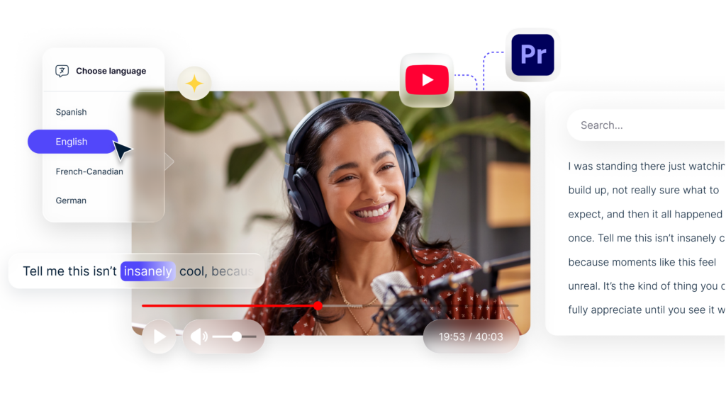
- Closed captions: Adding closed captions to a video supports viewers who are Deaf and hard of hearing. However, taking this step helps others as well. People may wish to play a video in a quiet office or a crowded train station. In those cases, and many more, having the captions makes the experience better for any site visitor.
- Adequate color contrast: People with colorblindness may not be able to read the text on a page if the contrast is poor. In situations where the background involves color gradiences or where people are reading in bright or dim conditions, inadequate contrast may create problems for any site visitor.
- Keyboard navigation: People with certain mobility-related disabilities may not use a mouse. Keyboard navigation allows these users to move through a page without one, often by using the tab key. Anyone with a temporary injury or whose mouse malfunctions can also navigate a page in this way.
Accessibility and UX design go hand in hand, which makes it more important than ever to prioritize both on a government website. In fact, when it comes to accessibility, these are things that government agencies should already be doing. After all, government entities face laws like the Americans with Disabilities Act and Section 508 of the Rehabilitation Act that set strict standards for accessibility.

Testing UX Design and Identifying Areas to Improve
In the case of UX design and accessibility, there are types of software that automate website checking. However, it’s wise not to rely entirely on the results of these types of software. No tool can fully identify all potential problems a person might face when trying to navigate a website. Having humans test the site is a must, and the testing group should include individuals with disabilities.
Also, remember that when you update the site, you’ll need to make sure that those changes don’t impact the UX design. The process of making a user-friendly site is ongoing, not something you can check off a to-do list and forget about.
When it comes to creating better, more accessible and user-friendly websites, partnering with experts can help. Verbit works with federal, state and local government agencies to provide accessibility solutions like captions, transcripts and audio descriptions. Connect with our team to learn more.